Jump To:
- Why Color Matters
- Consider the Style of the Building
- Factor in the Other Materials
- Plan Your Architectural Block Project
Designing your project comes with lots of decisions, whether you’re building from scratch or renovating an existing structure. Choosing the color and finish for your architectural concrete block may seem like a simple decision, but a lot goes into choosing those elements. The colors you select become a part of your façade, setting the tone and dictating the first impression people get when they see your home or business.
While important, the decision doesn’t have to be confusing. We’re here to help determine the best block style and color options for your next project.
Why Color Matters
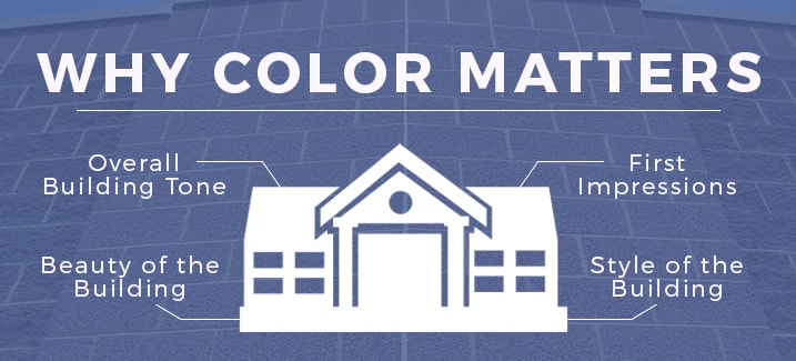
Before we discuss how to choose colors, it’s important to understand why color matters. Choosing project colors goes far beyond your favorite colors or what you prefer. Consider these reasons color matters for your project:
- Overall building tone: Color sets the tone of your building, and color can be even more powerful than the architecture in creating a feeling. What tone do you want your façade to convey? Does it show your business is modern and forward-thinking? Do you prefer a traditional tone? Color makes a major impact on the overall tone of the building, so consider what you want your façade to say to anyone who sees it.
- First impressions: Have you ever approached a building for the first time and wondered who would ever pick the colors on the façade? You notice things like the color of the building when you approach. Choosing colors strategically helps make a good first impression on anyone who visits your building. This can be particularly important for a business where making a good impression on clients can affect your bottom line.
- Beauty of the building: If you choose colors that don’t go well together, it affects the beauty of the building. The architecture might otherwise be stunning, but a poor choice in color can completely camouflage that beauty. Choose colors that are not only appealing individually, but that also look good together to create a pleasing look for your project.
- Style of the building: Color is also an influence when it comes to the style of a building. This can be particularly important if you’re renovating an older building. Keeping with the style of the building based on color creates an overall cohesive look. Choosing a color that doesn’t work well with the style can make the building look mismatched, and it takes away from the style.
Consider the Style of the Building
The style of the home or building you’re planning also has an impact on the color and finish of architectural blocks that will look best. While every style of building allows for some color and finish flexibility, some colors work better than others in a particular style.
Some examples of styles and colors that go well together include:
- Old World Style: Earthy tones, particularly grey and brown
- French Country: Warm tones, such as yellow and gold
- Tudor: Red with some variegation
- Modern: White, black or dark grey
Factor in the Other Materials
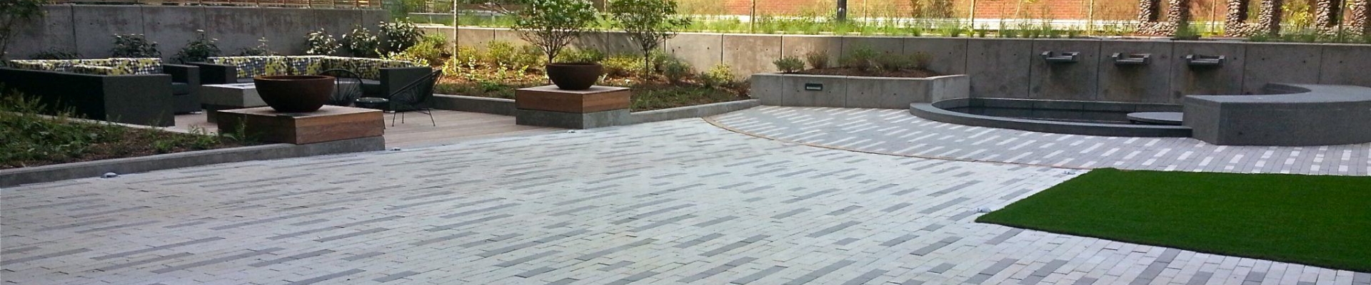
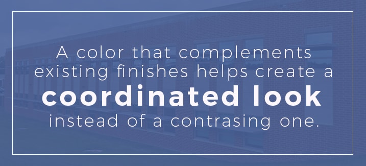
The other materials and textures in the project can help you choose a color and finish for your architectural block. A color that complements existing finishes helps create a coordinated look instead of a contrasting one. The goal is to get the colors to work together, rather than competing with one another.
Textures in the existing materials also come into play. You don’t want too many different textures going on, as that gets distracting and takes away from the beauty of the building. If your existing materials feature a lot of texture, stick with a smoother block for your new project. The opposite is also true. If your current materials are smooth and plain, consider adding a textured block to the overall design. Striving for balance is a good guiding principle when selecting the colors and finishes for your project.
Don’t Try to Match Colors
Have you ever tried to match a black shirt with black pants? It’s nearly impossible to get the exact same shade, even when you’re talking about a very distinct color like black. The same idea applies when selecting finishes for your construction project. Finding an exact match, especially if you’re trying to match to existing or older materials, is nearly impossible. Plus, it causes you undue stress when you’re already making lots of decisions for your building project.
A poor match can make the entire project look uncoordinated and unprofessional. It’s often easy to spot the attempt and the failure to match two colors. It’s tough to hide that mismatch once it’s placed in your project, too, so avoid the issue by not trying to match colors exactly.
Instead, find a different color that still works well with the rest of the façade. We have several color options that create a professional and visually stunning finished product. One option is to go a few shades lighter or darker than the color you’re trying to match. This keeps the materials from competing and makes it clear you aren’t trying to match exactly — yet it gives the project that same coordinated feeling.
Stick With a Neutral Shade
A neutral shade is always a safe bet when choosing finishes for a project. Neutrals blend well with a wide palette of colors on your existing materials. They also give you flexibility in the future to change the color of other materials. Those neutral architectural blocks will still fit with the overall design without being changed.
On a commercial project, for instance, neutral color choices are beneficial when it comes to signage. A neutral background makes your signs and logo stand out on your building, so your brand is easier to see. If you know you will mount a sign on your building, keep the colors in that signage in mind when choosing your neutral concrete block styles and colors.
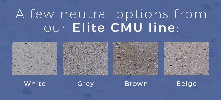
The neutral color you choose depends largely on the overall color scheme and your personal preference. A few neutral options that work well include some examples from our Elite CMU line:
Pull out an Accent Color
Another alternative to matching colors from other design elements in the project is to pull out accent colors. For example, if the project uses another type of stone, choose one of the less dominant colors from that stone. That color for your architectural stone creates a coordinating look since it comes from one of the colors already in the design. It also helps emphasize that color within the stone, which may have otherwise not been noticeable. If you have a stone material with flecks of green, for instance, choosing a green shade of architectural blocks can make that green color in the original stone more noticeable.
When choosing an accent color from the existing stone or other materials, choose a color you want to emphasize. For example, if the stone you’re coordinating with has hints of gold in it, make sure you want to have that golden hue as a focal point of the façade before choosing it as your architectural stone color.
Make a Bold Contrast
While many color recommendations focus on coordinating and blending for a more subdued look, you can also go the opposite direction to create a bold contrast in your design. These colors are vastly different, yet they still create a cohesive look on your façade.
An example is a modern black-and-white contrast. The dark color of the black stands out against the light color of the white material, but the two colors work well together. Another option is to choose architectural block in a rich, traditional red color. The red stands out, yet it maintains that traditional look so it doesn’t seem too loud or distracting in your overall design.
Cool vs. Warm Colors
You can create a cohesive look on your building by pairing warm colors together with other warm colors or cool colors with other cool colors. Color palettes tend to look more unified and pleasing when you choose predominately warm or cool colors. Choosing a completely different type of color for your architectural blocks can create a clashing look. A cool grey color won’t likely pair well with a warm yellow tone, for example.
Opt for Different Textures
Color isn’t the only way to vary the look of your project. Choosing a different texture or finish is a great way to get change the look and differentiate from the surrounding materials. Architectural stones come in a variety of styles and textures. The industry standards are split-face CMU and ground-face CMU.
Our Elite CMU product offers a filled and polished finish, while our Legacy Chiseled Face line creates a textured dimensional look. Our antique finish block gives a weathered look to your project. Terrazzo is an option if you prefer a polished look. It creates the look and feel of real terrazzo stone. Other products give you different looks and textures. The different lines come in various colors, allowing you to control both the color and the texture of your project.
Consider the Building Location
The colors you choose should work well with the building itself, but your home or business doesn’t exist in a bubble. Broadening your view to consider the immediate surroundings helps you choose colors and finishes that work well with the environment.
Your architectural block color should complement other buildings in your area, especially if the buildings are positioned closely. You don’t have to match exactly, but choosing colors that don’t clash is a good idea. It keeps the entire area looking cohesive and professional instead of choppy and disconnected.
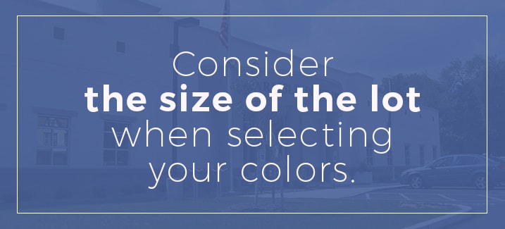
Consider the size of the lot when selecting your colors. A large building on a small lot can seem out of proportion. Incorporating a darker color of architectural block can make the building seem smaller. This helps it seem more to scale in comparison to the small lot. The opposite is also true. Light colors make a building seem larger, so you can give your small building a visual size boots by using white or similar light colors.
As you look around the lot, consider other elements, such as the parking lot and walkways. Choose an architectural block color that works with those elements to keep the entire space balanced instead of drawing attention to those areas.
The landscaping around the building is also a factor. The colors of the architectural stone should work with the landscaping that accents the property, especially if the landscaping is right next to the building.
Other Color and Finish Factors
The zoning for your location can come into play when choosing colors. Local governing bodies may regulate the look and style of buildings. If your project involves renovating a building with historical status, there may be even more restrictions on colors and modifications you can make. Some governing bodies require you to maintain similar color palettes or at least keep with the period of the building. You will likely need design elements approved if your business is in a historical building or if you own a historical home.
Some business parks or business districts also regulate the exterior appearance of buildings. Check with the property owner or the association that controls the district before making any decisions to ensure your color choices meet the requirements. On residential projects, a homeowner’s association may have guidelines or restrictions on renovations to maintain a consistent look or particular standard in the area. Read the community bylaws to determine if your neighborhood has any restrictions.
Also consider the specific use of the building, especially for commercial properties. An office building with a serious purpose, such as a therapist’s office, law office or accountant’s office, often uses neutral tones that create a subdued, professional appearance. If the building has a lighthearted purpose, such as a daycare center, ice cream parlor or toy store, bright or bold colors are more appropriate.
Tips for Choosing Your Colors and Finishes
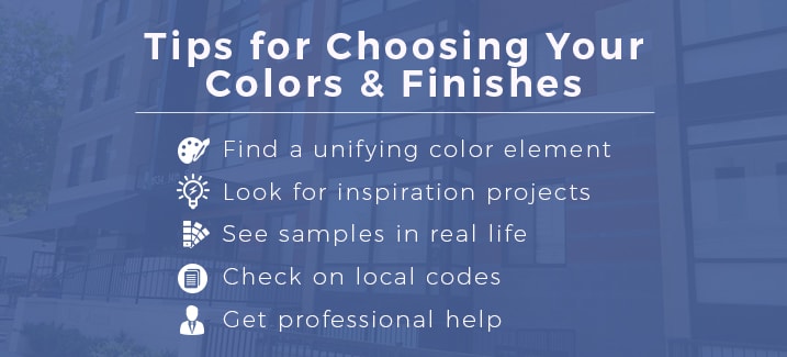
The final decision can be a challenging one. Check out these tips to help you narrow your list down to one final option:
- Find a unifying color element: Whatever color you choose, it should have some similar element to other colors used in the façade. The colors might both be warm or cool colors, for example. Or you might pull out an accent color from the main stone to choose the architectural stone.
- Look at inspiration projects: If you’re stuck on which colors to choose, look at portfolios or photo galleries of completed projects to see how various colors look together. This is particularly helpful when the buildings have a similar style to your own project. It is often difficult to imagine how an entire building or project would look in a particular color or finish when you look at a small sample. The finished project images bring the samples to life.
- See samples in real life: Seeing the colors on a computer screen is not accurate. Screen variations can affect how the colors look. Request a sample of the stone you are considering to see how it will actually look against the other materials in your project.
- Check on local codes: Following all codes put in place by your local governing body is an important part of the process.
- Get professional help: If you’re still not sure which color and finish to choose, consult with a professional. An experienced person in the field can provide suggestions and guidance.
Plan Your Architectural Block Project
Have you considered all the factors in choosing a color and finish for architectural concrete block designs? Whether you know exactly what you want or you need a little help deciding, Nitterhouse Masonry has the products to fit your project. Contact us for more information on our architectural blocks and how they can work with your color scheme and building project.